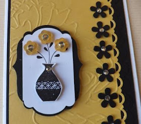
Yesterday I posted my version of the challenge sketch for A La Card Monkey. I indicated that in hindsight I should have added a Whisper White strip of cardstock under the Edgelits Scallop. Well let me tell you that bugged me all night. So, I've corrected that and here are some new photos showing off the revision. You tell me which you prefer:
#1 The Original Version:
Here's a full picture of the revised card. My personal choice is the Revised Version #2.
#1 The Original Version:
#2 The Revised Version showing off the Scallop:Here's a full picture of the revised card. My personal choice is the Revised Version #2.


Great card Penny. I too prefer the white under the edge. And I love your choice of colors; elegant.
ReplyDeleteI prefer the white, but if you would not of mentioned it I liked the original too. Great design.
ReplyDeleteI love the color combination. I liked both cards, but I think adding the white made a big difference.
ReplyDeleteI think the revised card pops better! Thanks for playing along with our challenge this week.
ReplyDelete