Tuesday, June 18, 2013

Great Stamp Sets: Papaya Collage

 
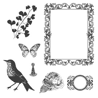
Papaya Collage is part of the "Step Outside" collection in the new 2013-2014 Stampin' Up! Idea Book and Catalogue and is featured on page 62.  

This seven piece stamp set offers a variety of stamp images that can be used singly or as a "collage" in your creations.  

Papaya Collage is one of those classic great value stamp sets and is offered in Wood or Clear Mount versions. It coordinates with the 3/4" Circle Punch on page 182 and will work nicely with some of the new framelit dies.
In the fall of 2011 I had the privilege of being asked by Stampin' Up! to be a featured Guest Artist in their May 2012 Stampin' Success Magazine, and my mission was to try out the brand new Papaya Collage stamp set. 


I needed to create at least 5 projects showcasing this set's versatility.  This was such a surprise and honour for me as a Stampin' Up! Demonstrator to be recognized in their demo only magazine and I was really looking forward to it.
To tell the truth, the invitation couldn't have come at a better time as I was planning on making a very special present for my mother's upcoming 90th birthday, and my theme was about "remembering life". 

I chose some old wedding photographs that were in a rich old sepia tone with some hand painted peach tones in the skin colouring. I decided to use neutral card stock and designer papers and add just a pop of colour with Calypso Coral to reflect the vintage look I was trying to capture from the picture.  My gift collection included a scrap book picture, a gift bag with matching gift card, a birthday card and a notebook for writing down all those memories.  Papaya Collage was absolutely perfect for this project because it gave me so many elements to play with.

Vintage Scrap Book Page:

This picture shows the layering of the floral image from the stamp set. To achieve this effect I stamped the floral image several times and then fussy cut the layers and assembled them with dimensionals.  It's not as time consuming as it sounds, but well worth the effort.
I used the Adorning Accents Embossing Folder for the small hearts pattern on the Very Vanilla strip. The sentiment "Remember When" is from the now retired stamp set "Word Play".  The Designer Frames embossing folder was used to cut out the beautiful Calypso Coral frame around the picture. 

The Birthday Card and Gift Tag:
I assembled a window frame design for the Birthday Card and stamped the cute little party hat in each of the boxes.  Love that repetition of images. I added lots of layers of DSP and card stock and a cute little lolly for a very festive look as well as three tiny Vintage Trinket brads.  I loved this card so much I redesigned it for swaps at Convention in 2012, using different card stock and designer paper. Everyone loved it.
Isn't this gift tag just the cutest.  It's a 3 x 3 card with a matching envelope which I made with the Simply Scored tool.  The card and envelope were a little fussy but really took very little time to make.  

I love butterflies and so does my mom, so I fussy cut a couple for the cover of the gift card.  I cut a 2 3/4 x 2 3/4" piece of Very Vanilla card stock and inked up the sentiment and flower image from Papaya Collage with Calypso Coral and Soft Suede markers to colour the edges of the leaves before stamping them and then glued this piece to the front of the small envelope. I really liked the soft look this gave to the leaves.
The Gift Bag:  
 I had fun making the gift bag from matching Designer Series Paper.  
Basically I repeated the gift card envelope design for the front of the gift bag only I used a piece of Very Vanilla card stock that was die cut with the Scallops Die.  Again I added butterflies and stamped the two toned leaves.  A splash of Calypso Coral card stock embossed with the Very Vintage Embossing Folder, made the front of this gift bag pop.  Some beautiful striped ribbon in Very Vanilla and Early Espresso and added for the bag handle. 
 The Note Book:

I used a small notebook from the Dollar Store covered with designer series paper for the base of this project.  There is a small pen housed in the side of the jacket cover.  The base cardstock was Calypso Coral. Absolutely every piece of card stock and stamped image was distressed with a sponge dauber for that aged look.
I stamped the scroll image from Papaya Collage using the Stamp-a-ma-jig along a strip of Soft suede and embossed it with Versa Mark Ink.  Once it was heat set, I took sponge daubers with Calypso Coral and Early Espresso inks and rubbed the surface to get a vintage look.  The brads were from the Antique Brads collection.
I stamped the beautiful butterfly images on Crumb Cake cardstock in Early Espresso ink and then fussy cut them out. Three small basic pearls were added to the centers and I curled the edges of the wings with my bone folder and mounted them with dimensionals.
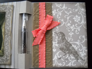
This view shows the inside of the notebook holder.  I covered the small notebook with DSP and stamped the bird image in Early Espresso.  A strip of Soft Suede cardstock formed a binding on the book, covering the edges of the DSP.  A small piece of Calypso Coral ruffled ribbon was tied around the book before it was mounted to the card base with sticky strip.  In this view you can see the small pen in its holder.  I bought the pens at Staples and they were in a variety of colours.  I lucked out with a brown pen to match the card design. 
I cut two tags with the Two Tags Die Cut in Very Vanilla to add to the notebook. The one on the front has the sentiment "Remember When" stamped on it and the second tag is stamped with the rose image.  Both tags were antiqued with a sponge dauber around the edges using crumb cake ink.
The Two Tag die cut on the inside actually covers the backside of the one used on the front of the notebook jacket and it's layered below the Papaya Collage Frame image.  I hand cut the center of the frame away with an X-acto knife and glued it in place over top of the photo.

I hope you liked this post on my gift set.  Although it's a year after the fact and many of the items used for this gift set have since been retired the one nice thing about vintage is "it's timeless".  Here are the products I would use to re-create this project today:

DSP:  Neutrals Designer Series Paper stacks Item #130132
Card Stock: Baked Sugar, Crumb Cake, Very Vanilla, Early Espresso, Cantalope Crisp & Pear Pizazz
Inks:  Baked Sugar, Crumb Cake, Early Espresso, Cantalope Crisp & Pear Pizazz
Ribbon:  Calypso Coral or Chocolate Chip Chevron Ribbon, and Crisp Cantalope 3/8" Ruffle Stretch Ribbon.
Accessories: Label Collection Framelits, Finishing Touches Edgelits, Butterfly punch, Beautiful Baroque Embossing Folder instead of Vintage one.

Monday, June 17, 2013

Michelle Zindorf CASE - Happy Birthday

My sister celebrated a milestone birthday at the end of May and because she is such a wonderful sister and inspiration I wanted to make a card that would show her my love and how very special she is to me.  

Some time ago I ran across a card tutorial by Michelle Zindorf that featured the stamp set "Elements of Style" which includes a hummingbird and floral image that I love.  Since hummingbirds are very special to me and my family , and this ethereal image was so awe inspiring, I knew I wanted to try my hand at a similar card for my sister's birthday. 

Here is Michelle's card and if you click on her name you can visit the tutorial on her blog site.


I think you can see why I fell in love with this picture. Isn't it just magical?

My Rendition:

For my card I decided to do a double card that included a full back card and a gate fold front with a holder for a gift card.    I followed Michelle's excellent tutorial to create the 3" circle with the stamped images.  This was mounted on a piece of Night of Navy card stock cut out with the Scallop Circle die.
 
This is a closeup of the detail on the flowers.  I added small basic pearls to the centers of some of the flowers and a piece of 1/8" satin ribbon which matched the blush blossom marker used to colour the darker parts of the flowers.  I also added some dazzling details to give it some dazzle and sparkle.  The sentiment "Life is a Matter of Moments" from the Elements of Style stamp set was stamped in Basic Black ink.  It seemed to be a really appropriate sentiment for a milestone birthday.
 
I cut a 5 1/2" by 11 piece of Night of Navy card stock for the card base and scored it at the center.  I stamped the Elements of Style flourish image in Night of Navy ink across the front of the card and on the inside right panel.  I cut a piece of Whisper White card stock using the Top Note die and stamped the sentiment "Not just a year older but a year better" from the Bring on the Cake stamp set. 


Inside view of the full card.

For the gate fold card I started with a piece of Bashful Blue cardstock that measured 4 1/4" x 8 1/2" scored at 2 1/8" and 6 3/8".  Two pieces of Old Olive card stock measuring 1 7/8" x 4" were cut and embossed with the Fancy Fold Embossing Folder before adhering them to the front panels of the Gate Fold.

This view shows the layers of the Gate Fold and the card front. The ribbon ties you can see at the side hold the card front closed so the gift card can't slip out. 


Here's a view of the Gatefold card when it's opened.
Two scalloped circles were cut from Blush Blossom card stock. A 3" circle from Whisper White was adhered to the bottom scallop circle.   The front scallop circle was scored and folded in half.

I stamped the hummingbird in basic black ink and then mounted this piece to the base with dimensionals. I used the paper piecing tool and the Festive Pack to add a design to the front of the scallop to simulate flight.  The small sentiment "for you" from Elements of Style was stamped in Basic Black ink on Blush Blossom and then punched out with the 1" circle punch and adhered with dimensionals.  Three small basic pearls were spaced out across the center.
This view shows the gift card inserted in the holder. 
Hope you enjoyed this post.  My sister loved her card, and I hear they just recently used the gift card for dinner at Earl's.

Friday, June 14, 2013

Paper Craft Crew Card Sketch #46 - Postage Card

Today I was browsing the Paper Craft Crew Challenge site and saw this week's great sketch.   

I liked this sketch for it's sheer simplicity, and it made me think of a post card.  Almost immediately I experienced an "Ah-hah" moment knowing what I wanted to create with it and headed for my craft room to dig through my supplies.

One of my first purchases from the new Stampin' Up! 2013-2014 Catalogue was the Post Card Back Ground stamp on page 102.  Since the sketch reminds me of a post card I figured this would work perfectly and what a great opportunity to add ink to this new stamp. 
Postage Card Back Ground Stamp which measures 5 x 3 1/2"

My next big decision was what card stock to use.  I wanted a vintage post card look in keeping with the stamp, so I decided to use the colours from  the Create with Connie and Mary's Color Challenge #256  this week which features Island Indigo, Summer Starfruit and Early Espresso. 


I didn't have any current postage stamp stamps so went with the one in the Fresh Vintage Stamp set (retired).  Believe me my next order will include something with stamps, either the set called Postage Due, which includes 3 wonderful stamps or Postage Collection  a 16 piece stamp set from the Hostess Stamps collection in this year's catalog.  This set includes 3 really neat postage stamp frames and you can design the stamp contents with any of the other images in the set.  Ask me how you can earn this set for free! 


Stamps:  Fresh Vintage (SAB) and Post Card Background Stamp #130369

Card Stock:  Island Indigo for Base (5 1/2" x 11), Summer Starfruit for 1st layer (5 1/4" x 4" embossed with Beautifully Baroque EF, Naturals Ivory  #102316, and Early Espresso.

Inks:  Island Indigo, Summer Starfruit, Early Espresso, Crumb Cake

Accessories: 3/8" Glimmer Brads (121003 Basics), Postage Stamp Punch #122344, Early Espresso Ribbon (retired), Beautifully Baroque Embossing Folder #130917(new), paper piercing tool, adhesive and dimensionals.

Tuesday, June 11, 2013

Stampin On Tuesday Masculine Card Class

With a number of male birthdays coming up and Father's Day just around the corner, I decided to kick off the first of my Stampin' on Tuesday Card Classes with some Masculine Cards.  

I don't know about you, but masculine cards have always been the most difficult ones for me to make, and I always have to put my thinking cap on when making them.  For this set, I wanted something that would be exciting and fun to make.

To begin with, I don't have a lot of masculine or graphic themed stamps.  I need to change that, don't you think?  And, I've made lots of shirt and tie related cards in the past, so it's high time to find something new and modern!

With that in mind, I set out to design four simple cards with a minimal amount of stamping, modern colours and design elements and appeal for men.  I also wanted a variety of cards that would work for any occasion such as Father's Day, Birthday, Retirement, Graduation, Thinking of You, and Encouragement.  Tall order you say?  I checked out card shops locally and did some searching on the internet and with a little help here's what I came up with, I hope you enjoy them:

Card Number One: Striped Masculine Card


If you're like me you probably have lots of scrap card stock kicking around, so here's a great way to use up those those bits and pieces.  

This simple card starts with a standard  5 1/2" x 4 1/4" base in Crumb Cake,  followed by a 5 1/4" x 4" layer of Whisper White.  Add 1/4" inch stripes in Basic Black, Marina Mist, Cherry Cobbler and Crumb Cake. Very the length of the strips in conjunction with the size of the sentiment stamp you use.  You can also change up the direction of the card and have the fold at the top and your stripes layered horizontally for a different look.  I stamped this big bold birthday sentiment from the "You're Amazing" Stamp set in basic black ink.  I think it adds a very masculine look to this card front.
Card Number Two:  Washi Tape Birthday Card

Have you used Washi Tape yet?  Well this next card features the Washi Tape from the Epic Day - This and That Collection.  This was my first experiment with it and I'm in love!

What fun!  There are three spools in each of Stampin' Ups! Washi Tape  collections and they are 3/8", 1/2", 5/8" in width.  Each spool has 5 yards of tape.  

These beautiful translucent tapes have a lot of flexibility to them.  They're light weight and can be easily be removed or repositioned without damaging the card stock or leaving marks behind.  Note:  Washi tape is not the same composition as adhesive tape (think Magic tape), so they aren't strong enough to permanent bind objects together, they are more for decorative purposes.  

I got inspiration for my card when I recently attended Deb Smart's New Catalogue Open House.    Here is what her card looked like:
Deb's card uses the Gingham Washi Tape Collection and Serene Silhouettes Stamp set.


I've used all three of the Washi Tapes in the Epic Day set and created a grid pattern. You can create whatever pattern that appeals to you when making this card.  The card base is in Crumb Cake and the first layer is Calypso Coral Card stock measuring 5 1/4" x 4".  The Whisper White layer is 5" x 3 3/4". The sentiment is stamped with the Pretty Petites and That's the Ticket stamp sets on Whisper White card stock.  I used the new Petite Curly Label punch for the happy birthday sentiment and the Ticket Duo Builder punch for the basic gray layer and the happy birthday ticket image.  Note: To create the ticket layers I fussy cut around the Calypso Coral stamped image.
If you stamp on Washi tape you create a whole new look.  For this card I used Basic Gray classic ink, and the image from The Open Sea.  I also spritzed the card face with Calypso Coral, Basic Gray and Crumb Cake re-inkers for a splotched appearance.  Tip:  Leave some extra drying time for the stamping on the Washi Tape as the ink does not dry as quickly as it does on card stock, and you wouldn't want to smudge it.
Card Number Three:  Colour Swipe All Occasion

My next card uses a direct to paper technique where you literally take your ink pad and swipe it across your card stock. Thus the name "Colour Swiping". 

I'd actually forgotten about this method of stamping but my interest was rekindled by Julie Davidse's blog post titled "Feeling Blue".  

I liked Julie's great card with its free flowing design and blend of colours, and decided this technique would work perfectly for the card I had in mind.  Here's my card:  

I used Soft Sky one of the new Subtles Collection colours along with Basic Gray and Midnight Muse cardstocks and inks for my card.  The Labels Collection framelit dies were used to cut the stacked sentiment and backing labels. Three 3/8" Silver Mini brads were added for some interest.
The sentiment stampwhich I feel is very versatile and could be used for almost any occasion such as "Retirement, Congratulations, Graduation or Encouragement is from a very special stamp set that Stampin' Up! distributed to demonstrators who attended the 2012 SU Convention in Salt Lake City.  It is aptly titled "I Am....".  This years new catalogue has many sentiments that would also be perfect for this style of card.

To finish off this card I wanted to add movement and a sense of going somewhere.  To achieve this I chose to add a strip to simulate a tire tread.  I did this by embossing a  1" strip of silver duct tape and glued it behind the sentiment labels layers.  I also added three 3/8" mini silver brads to draw the eye across the card face.  I don't know if anyone else gets my theme for this card, but for me it was "mission accomplished".


Card Number Four:  Open Sea Double Flip Card

The last card in my Masculine card class is one of those WOW cards that I wish you could see in 3-D because it's really very special.  I cased it exactly the way it was shown and I have to give full credit for the design and execution of this card to Tammi White of "Stampin' With Tami".

The card base is in Crumb Cake and is cut 7 1/2" x 4 1/4".  I used the 2nd and 3rd label dies from the Label Collection die cuts produced by Stampin' Up!.  The beautiful stamped images are from one of my all time favourite sets, The Open Sea.  I hope you enjoy this card.  
This is the front view of the flip card.  When it is completely open the ship will face the back of the card.

This view shows the inside view of the flip.  Pretty cool eh?  I just loved doing this fast and easy card. 


These two views show a little of the stamping detail.  Ink colours were Midnight Muse, Soft Suede and Crumb Cake.  Cardstock was Midnight Muse, Soft Suede and Ivory Naturals.
The Open Sea


Sunday, June 2, 2013

Reorganizing - Out With The Old In With the New!


All That Stuff:
I love all my stamp sets, tools and accessories that I've accumulated over the past few years as a Stampin' Up! Demonstrator.  But, once I acquire something, I'm not very good at letting it go.  

Every year as the retirement lists are released and I separate the retired stamps and accessories from the ones that remain current, I realize that I just have way too much stuff and all that clutter is killing my creativity. I know I have to stop procrastinating, but somehow I manage to continue.

Every time I try and start stamping, I'm  wasting endless amounts of time digging through "my stuff", moving "my stuff", and of course trying to find "the right stuff".  Well, you know the story........by the time I find what I'm looking for and settle in to stamp I'm just way too tired or I've lost the desire. 

The Decision:
So this year I decided to do something about "my stuff" and I'm trying to turn over a new leaf with the procrastination problem.  

With the release of the new catalogue and new products in June, I decided to grab the opportunity to not only "Refresh" all my "Colour Collections", but to "refresh and reorganize my stamping space and prepare to sell things I'm no longer using.  It was a tough decision but one that had to be made! 

The Process:
  1. First things first. I began by scrutinizing my space and drafting a plan of attack.  
  2. I scheduled a full day (without interruptions) for room cleanup and reorganization of my studio and prep room areas. 
  3. I got three empty bins and put a sign on each bin indicating its purpose:
    1. Things I couldn't part with were put in the "Keep" bin
    2. Things I could part with were put in the "Sell" bin
    3. Things that I couldn't make up my mind about went into the
      "Undecided" bin for further review.
  4. After looking at pictures of organized stamp rooms on line and in a few magazines, I decided I needed to purchase some smaller sized storage bins to hold my tools and accessories. With that in mind  I bought two sizes of lidded plastic storage bins from Walmart, that were open stock. They came in bright green, pink and/or white and I opted for the bright green to give my room some pizzazz. 
  5. I began organizing my prep room first by simply putting all the retired and no longer in use items into the appropriate marked storage bins, and moving them out of the area when I was finished.
  6. Once the shelving in my prep room was bare I began the process of cleaning the shelves and repositioning my tools and accessories.
The following are pictures of my new "clean" and organized prep area. 

This is the back wall in my prep room area.  I would eventually like to get a four-drawer legal filing cabinet to replace all these stacking storage containers.  But for now, they hold all my envelopes and paper supplies and other crafting materials.
This shelving unit displays some of my current projects.  The file boxes on the upper shelf are used for storing cards and to separate projects during my workshops. I keep all my reference magazines and books on the lower shelves.
The next shelf area holds  all my Clear Mount Stamps and MDS Studio disk.  It's easy to reach them from my desk area when I want to grab a new stamp set in a hurry.  The bottom shelves hold all my previous Stampin' Up Catalogues.  I plan to keep only one catalogue for each year for reference information and before the end of the year get rid of all the other out of date catalogues.  It will free up a couple of more shelves.

This desk was an old one I salvaged from our move and it works perfectly for prepping card stock and working on projects when I'm by my self.  My wonderful brother-in-law Ken built the shelving unit that fits on top of the desk and it holds all my markers, dauber cases, adhesives, clear block, stamp scrubber and scissors.  The lower shelves hold my Stamp-a-ma-jig, spritzer, heat gun and cutting boards. 

Here you can see some of the green plastic storage bins I bought at Walmart.  The large ones hold all my ribbon, while the shoebox size were perfect for stashing other accessories and supplies for projects.  I keep all my punches on a small shelving unit at the back of the room. 
 

All my inks and re-inkers past and present are together on this shelf along with my embossing powders (in a Keurig holder).   On the lower shelf I have all my Sizzix and  Big Shot  Die Cuts in more of the green plastic bins.  I also have my embossing folders in a bin.  It's so easy now to just carry the bin to the Big Shot station in the studio and everything is at hand. 


The Sale:
Once I had my prep room tidy I tackled the studio area.  I followed the same principle and purged the area of things I wanted removed.  The result was a cleaner fresher room with updated samples and work station areas.  I'm sure my customers will like it a lot better.  

The one thing this area desperately needs is adequate lighting.  Right now I am functioning with a number of lamps which is okay but installation of overhead lighting will free up some more floor space (it's in the future development plan).  I also want to paint both areas and begin adding some display boards.....stay tuned for those pictures!  


Just look at all these stamp sets and accessories I wound up having for sale. Once my rooms were cleaned up I put everything from the sale bins onto my pool table priced everything,in preparation for the garage sale.

On Sunday the 9th of June, I joined my two downlines, Ethel and Sheri in Langley for an outdoor garage sale event held by Clipper Street a local paper crafting and scrapbooking store.  Despite the inclement weather it was a successful sale.  We'll be doing it again on Sunday July 7th.  
Tarps to the rescue.  It just poured and everything was soaked. 
Sheri and Ethel waiting for the rain to die down.

Sheri's booth was right next to ours and she saw lots of action throughout the day.
Despite the inclement weather lots of folks showed up for the sale.

Ethel, hoping for a sale. 

Sheri had this great apron from a breast cancer fund raiser and it worked so well for collecting her sales money.

Saturday, June 1, 2013

Best of 25 Years Anniversary Stamps - June Edition


What's So Special About 25 Year Anniversary Stamp Sets?
  • All "Best of" stamp sets include 3-5 images, including a never-before seen image (see yellow highlighted stamp on my post).  These sets are just $17.95, a great bargain!
  • Each month Stampin’ Up! will release a new “Best of" stamp set featuring a new theme.  But don't worry you can still get all the previous months sets, because they'll all be available until March 31, 2014.
  • Check out the new PDF flyer posted every month for each new “Best of” set.
  • All “Best of” stamp sets are only available in Clear-Mount and you will need Clear-Mount Blocks B, C, and G for this set.

You never have to be at a loss for the right words with the June Edition of the Best of 25 Years Anniversary Stamps called: Best of Greetings. With this set, you have the perfect saying for almost any occasion!

Atlantic Hearts Sketch Challenge #572:

April has sure been living up to its reputation for rain showers but it's been really on the cold side which isn't normal for this t...